pacman::p_load(tidyverse, scales, DT, plotly, ggplot2)Take Home Exercise 2
Objective
In this particular section, we will revisit Take-home Exercise 1 which visualises trends in the Real Estate Market of Q1 2024.
We will pick a visualisation which the author can learn from to improve on it’s clarity and aesthetics by way of using the best practices for visualizing data.
Original Visualisation
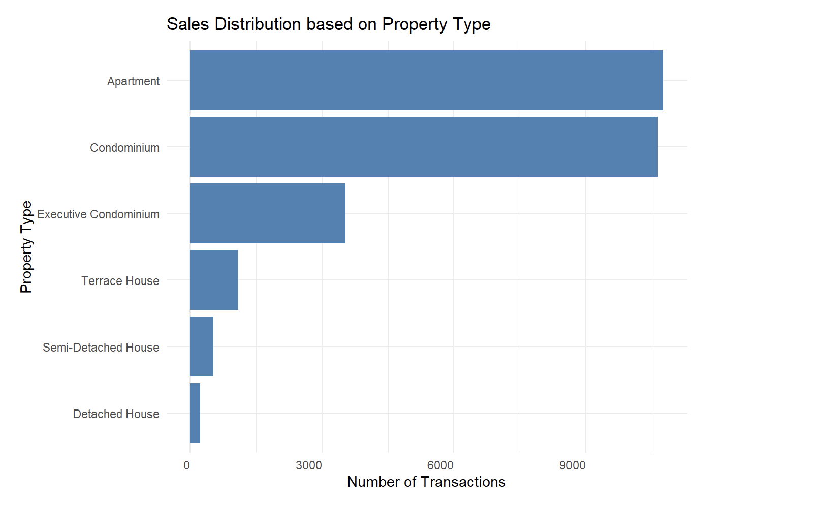
We will focus on Arya Siahaan visualization of “SALES DISTRIBUTION BASED ON PROPERTY TYPE IN SINGAPORE PRIVATE RESIDENTIAL MARKET”.
Review
The interpretation of the data is very forward at a glance.
The results are also extremely straightforward, we are able to tell which property garners the highest volume of sales.
There is not much data nor further story telling to be had and this can be achieved easily with a simple excel function.
There is no interaction with the graphs hence, it is not possible to tell the exact numbers for each property type.
In addition, it is also possible to merge both of Aryan’s graph together such that they show a comprehensive picture of the private estate resale market.
How might we do it differntly.
Firstly, we have to ascertain the story point which we would like to tell which is:
What is the quaterly sales volume of each property type in Singapore?
To do that, we will need the following datapoints from the RELIS database:
Property Type
Sale Date
Transacted Price ($)
Broadly speaking, we will need to do the following data wrangling followed by visualisation:
- First is to bin the sale date of each transaction into the respective quarters
- Plot an initial bar graph of the quarterly sales volume
- Plot a second line graph showing the trend of the quarterly sales volume
- Merge the two graphs together with ggplot
- Finishing up with theming touches and interactions
Data preparation
Loading the required packages
Data Extraction
First we will import the data from the 5 csv files from RELIS
# Define the paths to the individual CSV files
file1 <- "data/ResidentialTransaction20240308160536.csv"
file2 <- "data/ResidentialTransaction20240308160736.csv"
file3 <- "data/ResidentialTransaction20240308161009.csv"
file4 <- "data/ResidentialTransaction20240308161109.csv"
file5 <- "data/ResidentialTransaction20240414220633.csv"

# Reading the individual CSV files
data1 <- read_csv(file1)
data2 <- read_csv(file2)
data3 <- read_csv(file3)
data4 <- read_csv(file4)
data5 <- read_csv(file5)

# Combining the data frames into one
combined_transaction <- bind_rows(data1, data2, data3, data4, data5)

# Viewing the data structure given
col_names <- names(combined_transaction)
col_names
[1] "Project Name" "Transacted Price ($)"
[3] "Area (SQFT)" "Unit Price ($ PSF)"
[5] "Sale Date" "Address"
[7] "Type of Sale" "Type of Area"
[9] "Area (SQM)" "Unit Price ($ PSM)"
[11] "Nett Price($)" "Property Type"
[13] "Number of Units" "Tenure"
[15] "Completion Date" "Purchaser Address Indicator"
[17] "Postal Code" "Postal District"
[19] "Postal Sector" "Planning Region"
[21] "Planning Area" Secondly, we will bin the data into Q1,Q2,Q3 and Q4
combined_transaction <- combined_transaction %>%
  rename_with(~ gsub(" ", "_", .), everything())

combined_transaction$Sale_Date <- as.Date(combined_transaction$Sale_Date, format = "%d %b %Y")
combined_transaction$Quarter <- paste(year(combined_transaction$Sale_Date), "Q", quarter(combined_transaction$Sale_Date), sep="")
combined_transaction$Month <- month(combined_transaction$Sale_Date, label = TRUE)
We will then use databtable to get a glimpse of our combined_transaction tibble
datatable(head(combined_transaction, n = 20))Data Wrangling
Plotting initial graph
The initial graph shall be a barchart which shows the Number of Transactions by each Quarter
# Plotting transactions by property type across quarters
ggplot(combined_transaction, aes(x = Quarter, fill = Property_Type)) +
  geom_bar(stat = "count", position = "dodge") +
  labs(title = "Transactions  by Property Type from Q1 2023 to Q1 2024",
       x = "Quarter",
       y = "Number of Transactions",
       fill = "Property Type") +
  theme_minimal()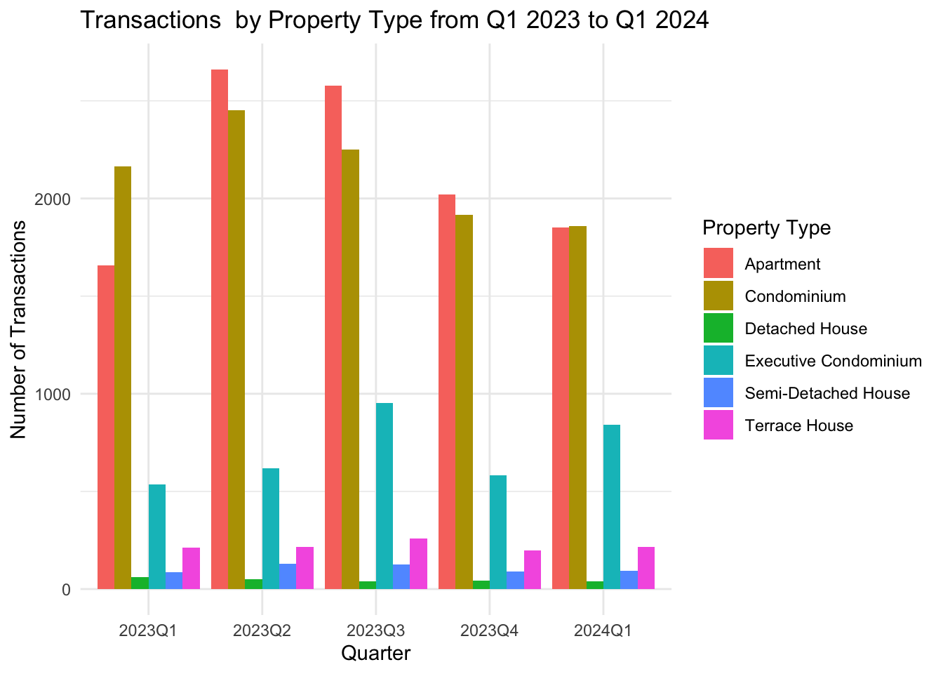
Plotting secondary graph
The secondary graph shall show the line trend of the Number of Transactions by each Quarter.
aggregated_data <- combined_transaction %>%
  group_by(Quarter, Property_Type) %>%
  summarise(Transactions = n(), .groups = 'drop')  # `n()` counts the number of rows in each group

# Plotting transactions by property type across quarters using a line graph
ggplot(aggregated_data, aes(x = Quarter, y = Transactions, color = Property_Type, group = Property_Type)) +
  geom_line() +  # Adds lines
  geom_point() + # Adds points at each data entry
  labs(title = "Transactions by Property Type from Q1 2023 to Q1 2024",
       x = "Quarter",
       y = "Number of Transactions",
       color = "Property Type") +
  theme_minimal() # Improve label readability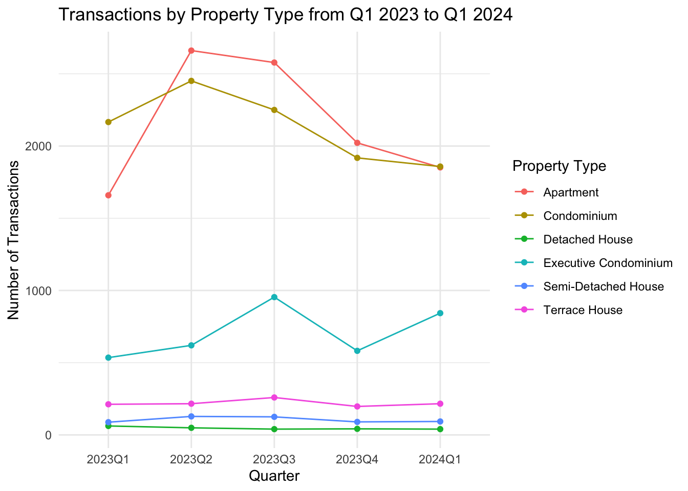
Combining it together
We will then merge both the graphs together to have a clear picture of each quarter’s transactions volumes
# Getting the mean number for each property transaction for all quarters
  average_data <- aggregated_data %>%
  group_by(Property_Type) %>%
  summarise(Average_Transactions = mean(Transactions))

# Start with the bar graph
p <- ggplot(aggregated_data, aes(x = Quarter, y = Transactions, fill = Property_Type)) +
  geom_bar(stat = "identity", position = position_dodge(), width = 0.6) +  # Draw the bars

  # Add the line graph
  geom_line(aes(group = Property_Type, color = Property_Type),
            position = position_dodge(0.6), size = 0.5) +

  # Adding mean line
geom_hline(data = average_data, aes(yintercept = Average_Transactions, color = Property_Type,
                                      text = paste("Property Type:", Property_Type,
                                            "<br>Average Transactions:", Average_Transactions)),
linetype = "dashed", size = 0.35) +
  # Labels and themes
  labs(title = "Transactions by Property Type from Q1 2023 to Q1 2024",
       x = "Quarter",
       y = "Number of Transactions",
       fill = "Property Type",
       color = "Property Trend Line") +
  theme_minimal()

# Print the plot
p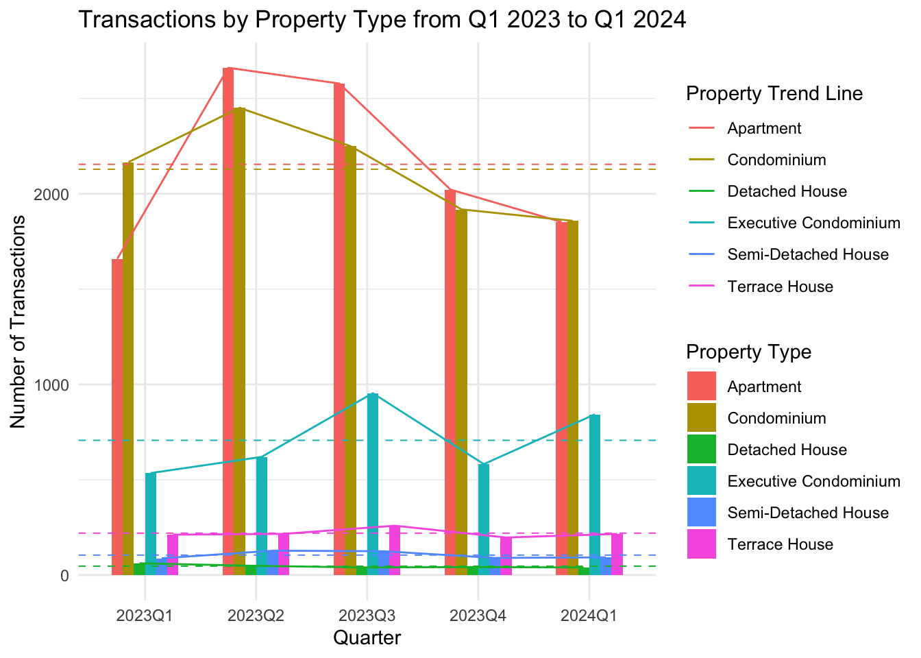
Finishing touches with Interaction using Plotly
Finally we will add in Plotly’s interactive capability.
# Convert the ggplot object to a plotly object
p_interactive <- ggplotly(p, tooltip = "text")

# Customize the hoverlabel for better appearance
p_interactive <- layout(p_interactive, hoverlabel = list(bgcolor = "white"))

# Print the interactive plot
p_interactive
Conclusion
With our own interpretation translated into amendments on Arya Siahaan visualization completed above, below is a recap on the changes we have done and reasoning for the associated
| S\N | Aryan’s Visusalisation Element | Our Changes |
|---|---|---|
| 1 | 2 seperate bar graphs to showcase monthly sales volume and it’s distribution by property type. | Using ggplot library to merge both sets of visualization into a single graph so that end users will not have to scroll between 2 graphs to make the reconciliation |
| 2 | Mono color scheme for different property types represented in a bar graph | Using ggplot’s themes to segregate property types into colors for easier identification |
| 3 | Sales volume transaction is represented in different months instead of Quarters | Binned transactions into their respective quarters for ease of comparison as required by the Professor. |
| 4 | Static data visualization | Added plotly’s interactive elements such that onhover, detailed transaction numbers can be taken immediately. |
| 5 | Mean line for total sales’ volume graph only | Segregated each property types’ mean transaction for all 5 quarters |