pacman::p_load(ggdist, ggridges, ggthemes,
colorspace, tidyverse)Hands-On Exercise 4
#Learning Objectives
In the earlier chapters we have shared dealt with some of the popular statistical graphics methods for visualising distribution such as histogram, probability density curve (pdf), boxplot, notch plot and violin plot and how they can be created by using ggplot2.
In this handson, we are going to use new statistical graphic methods for visualising distribution, namely ridgeline plot and raincloud plot by using ggplot2 and its extensions.
For the purpose of this exercise, the following R packages will be used, they are:
ggridges, a ggplot2 extension specially designed for plotting ridgeline plots,
ggdist, a ggplot2 extension spacially desgin for visualising distribution and uncertainty,
tidyverse, a family of R packages to meet the modern data science and visual communication needs,
ggthemes, a ggplot extension that provides the user additional themes, scales, and geoms for the ggplots package, and
colorspace, an R package provides a broad toolbox for selecting individual colors or color palettes, manipulating these colors, and employing them in various kinds of visualisations.
Loading the packages
Importing the data
exam <- read_csv("data/Exam_data.csv")Visualising Distribution with Ridgeline Plot
Ridgeline plot (sometimes called Joyplot) is a data visualisation technique for revealing the distribution of a numeric value for several groups of categorical indicators.
Distribution in Ridgeline plot can be represented using histograms or density plots, all aligned to the same horizontal scale and presented with a slight overlap.
ggplot(exam,
       aes(x = ENGLISH,
           y = CLASS)) +
  geom_density_ridges(
    scale = 3,
    rel_min_height = 0.01,
    bandwidth = 3.4,
    fill = lighten("#7097BB", .3),
    color = "white"
  ) +
  scale_x_continuous(
    name = "English grades",
    expand = c(0, 0)
    ) +
  scale_y_discrete(name = NULL, expand = expansion(add = c(0.2, 2.6))) +
  theme_ridges()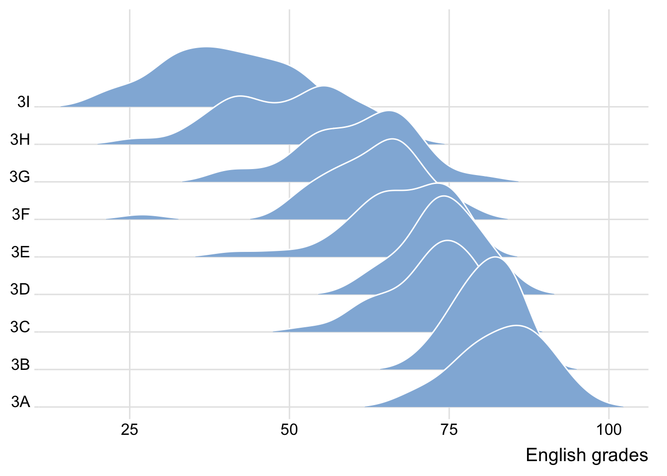
Note
Ridgeline plots make sense when the number of group to represent is medium to high, and thus a classic window separation would take to much space. Indeed, the fact that groups overlap each other allows to use space more efficiently. If you have less than 5 groups, dealing with other distribution plots is probably better.
It works well when there is a clear pattern in the result, like if there is an obvious ranking in groups. Otherwise group will tend to overlap each other, leading to a messy plot not providing any insight.
Plotting ridgeline graph with ggridges method
ggridges package provides two main geom to plot gridgeline plots, they are: geom_ridgeline() and geom_density_ridges(). The former takes height values directly to draw the ridgelines, and the latter first estimates data densities and then draws those using ridgelines.
ggplot(exam,
       aes(x = ENGLISH,
           y = CLASS)) +
  geom_density_ridges(
    scale = 3,
    rel_min_height = 0.01,
    bandwidth = 3.4,
    fill = lighten("#7097BB", .3),
    color = "white"
  ) +
  scale_x_continuous(
    name = "English grades",
    expand = c(0, 0)
    ) +
  scale_y_discrete(name = NULL, expand = expansion(add = c(0.2, 2.6))) +
  theme_ridges()
Having various colors on X axis in ridgelines
This effect can be achieved by using either geom_ridgeline_gradient() or geom_density_ridges_gradient(). Both geoms work just like geom_ridgeline() and geom_density_ridges(), except that they allow for varying fill colors.
ggplot(exam,
       aes(x = ENGLISH,
           y = CLASS,
           fill = stat(x))) +
  geom_density_ridges_gradient(
    scale = 3,
    rel_min_height = 0.01) +
  scale_fill_viridis_c(name = "Temp. [F]",
                       option = "C") +
  scale_x_continuous(
    name = "English grades",
    expand = c(0, 0)
  ) +
  scale_y_discrete(name = NULL, expand = expansion(add = c(0.2, 2.6))) +
  theme_ridges()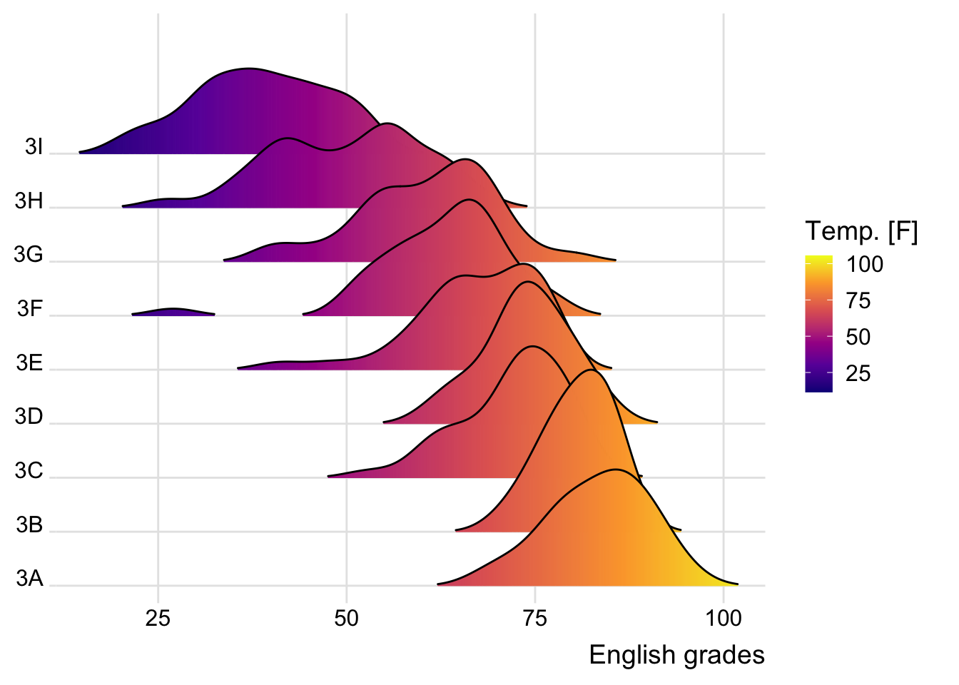
Note
- This method does not allow for transaprency given it’s limitations
Mapping probabilities using color
ggridges package also provides a stat function called stat_density_ridges() that replaces stat_density() of ggplot2.
This is done by mapping the probabilities calculated using stat(ecdf) which represent the empirical cumulative density function for the distribution of English score.
ggplot(exam,
       aes(x = ENGLISH,
           y = CLASS,
           fill = 0.5 - abs(0.5-stat(ecdf)))) +
  stat_density_ridges(geom = "density_ridges_gradient",
                      calc_ecdf = TRUE) +
  scale_fill_viridis_c(name = "Tail probability",
                       direction = -1) +
  theme_ridges()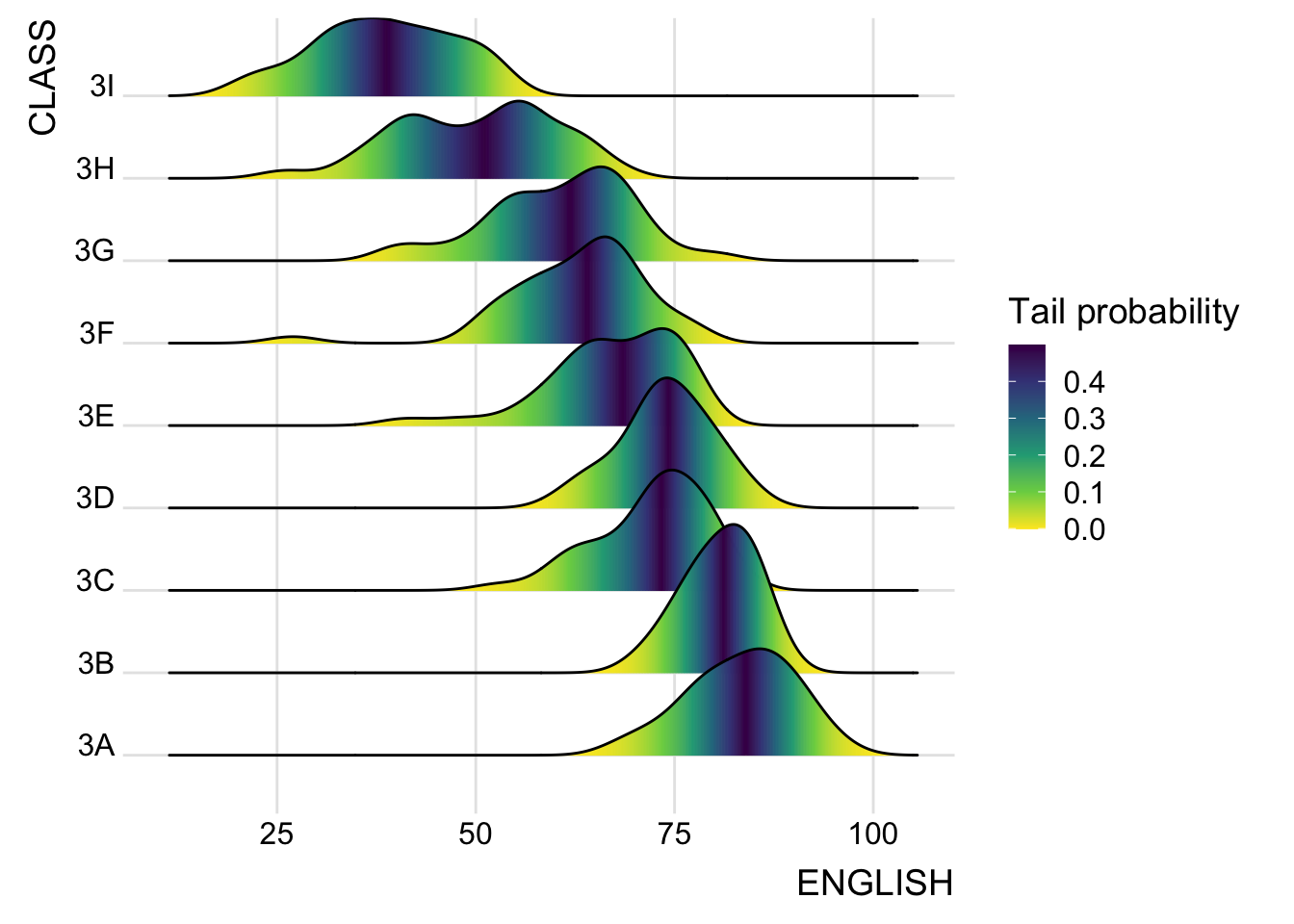
Note
The empirical cumulative distribution function (ECDF) provides an alternative visualisation of distribution. Compared to other visualisations that rely on density (like geom_histogram()), the ECDF doesn’t require any tuning parameters and handles both continuous and categorical variables. The downside is that it requires more training to accurately interpret, and the underlying visual tasks are somewhat more challenging.
Quantile–quantile (q-q) plots are a useful visualization when we want to determine to what extent the observed data points do or do not follow a given distribution. Just like ecdfs, q-q plots are also based on ranking the data and visualizing the relationship between ranks and actual values.
It is important include the argument calc_ecdf = TRUE in stat_density_ridges().
Ridgeline plots with quantile lines
By using geom_density_ridges_gradient(), we can colour the ridgeline plot by quantile, via the calculated stat(quantile) aesthetic as shown in the figure below.
ggplot(exam,
       aes(x = ENGLISH,
           y = CLASS,
           fill = factor(stat(quantile))
           )) +
  stat_density_ridges(
    geom = "density_ridges_gradient",
    calc_ecdf = TRUE,
    quantiles = 4,
    quantile_lines = TRUE) +
  scale_fill_viridis_d(name = "Quartiles") +
  theme_ridges()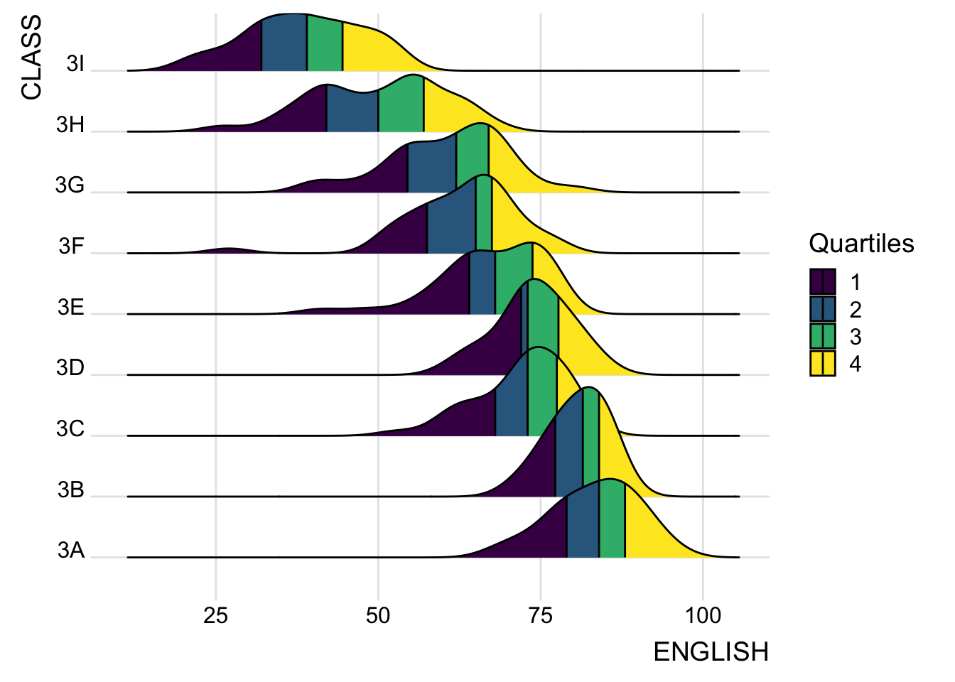
Specifying quantiles by cut points
Instead of using number to define the quantiles, we can also specify quantiles by cut points such as 2.5% and 97.5% tails to colour the ridgeline plot as shown in the figure below.
ggplot(exam,
       aes(x = ENGLISH,
           y = CLASS,
           fill = factor(stat(quantile))
           )) +
  stat_density_ridges(
    geom = "density_ridges_gradient",
    calc_ecdf = TRUE,
    quantiles = c(0.025, 0.975)
    ) +
  scale_fill_manual(
    name = "Probability",
    values = c("#FF0000A0", "#A0A0A0A0", "#0000FFA0"),
    labels = c("(0, 0.025]", "(0.025, 0.975]", "(0.975, 1]")
  ) +
  theme_ridges()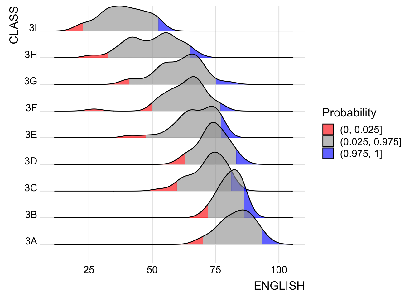
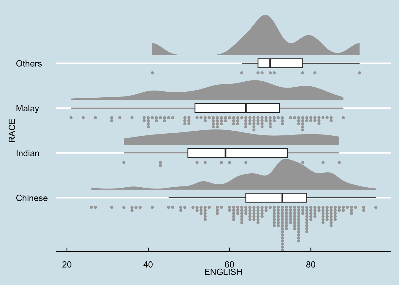
Visualising distribution with Raincloud plot
Raincloud Plot is a data visualisation techniques that produces a half-density to a distribution plot. It gets the name because the density plot is in the shape of a “raincloud”. The raincloud (half-density) plot enhances the traditional box-plot by highlighting multiple modalities (an indicator that groups may exist). The boxplot does not show where densities are clustered, but the raincloud plot does!
Plotting a halfeye graph
ggplot(exam,
       aes(x = RACE,
           y = ENGLISH)) +
  stat_halfeye(adjust = 0.5,
               justification = -0.2,
               .width = 0,
               point_colour = NA)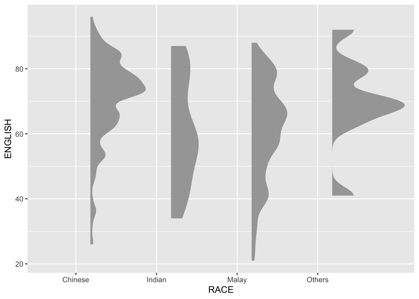
We remove the slab interval by setting .width = 0 and point_colour = NA.
Adding the boxplot with geom_boxplot()
ggplot(exam,
       aes(x = RACE,
           y = ENGLISH)) +
  stat_halfeye(adjust = 0.5,
               justification = -0.2,
               .width = 0,
               point_colour = NA) +
  geom_boxplot(width = .20,
               outlier.shape = NA)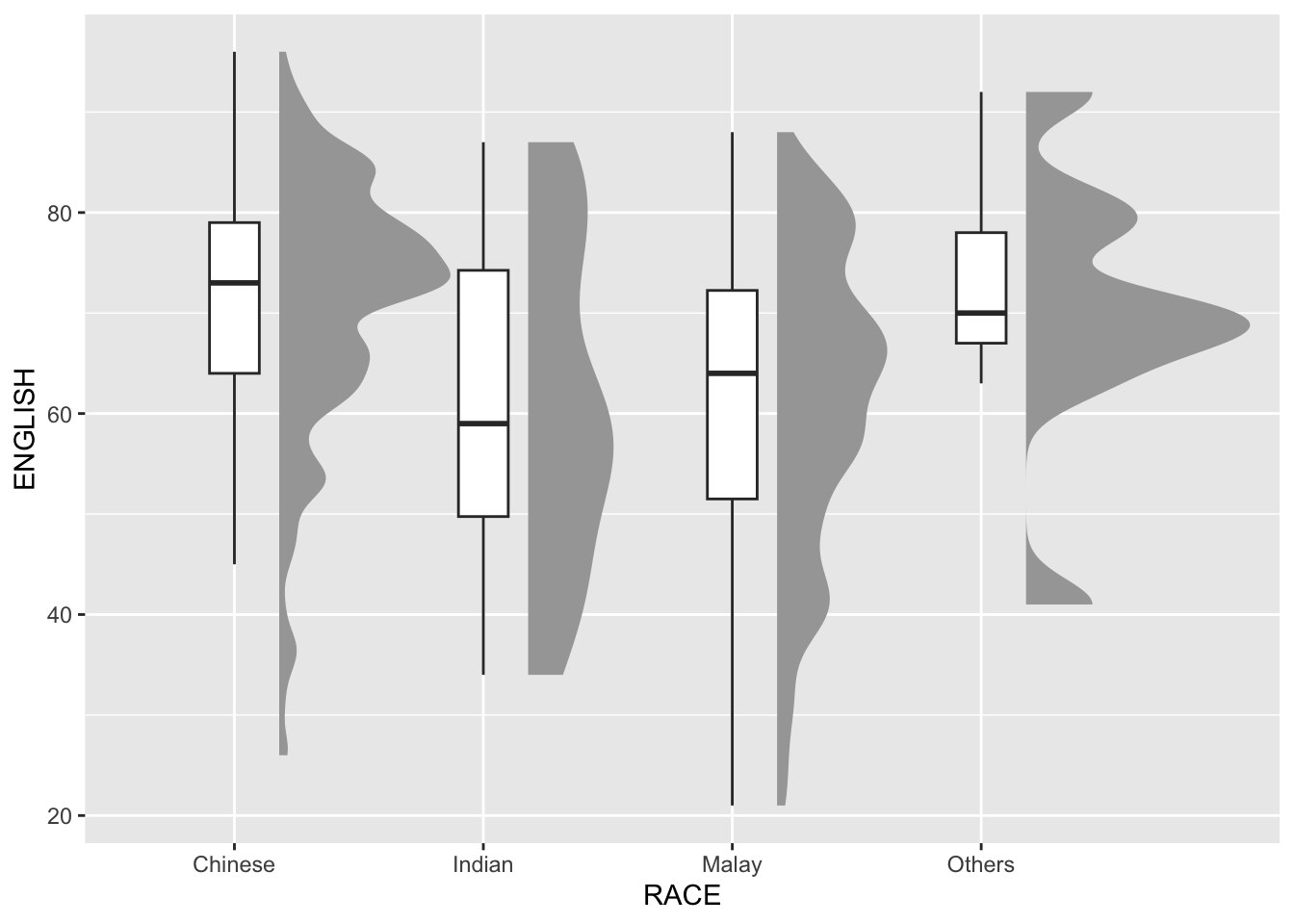
Adding the Dot Plots with stat_dots()
ggplot(exam,
       aes(x = RACE,
           y = ENGLISH)) +
  stat_halfeye(adjust = 0.5,
               justification = -0.2,
               .width = 0,
               point_colour = NA) +
  geom_boxplot(width = .20,
               outlier.shape = NA) +
  stat_dots(side = "left",
            justification = 1.2,
            binwidth = .5,
            dotsize = 2)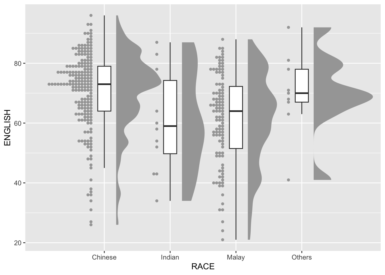
Adding themes with theme_economist()
ggplot(exam,
       aes(x = RACE,
           y = ENGLISH)) +
  stat_halfeye(adjust = 0.5,
               justification = -0.2,
               .width = 0,
               point_colour = NA) +
  geom_boxplot(width = .20,
               outlier.shape = NA) +
  stat_dots(side = "left",
            justification = 1.2,
            binwidth = .5,
            dotsize = 1.5) +
  coord_flip() +
  theme_economist()